top of page
The primary reason I chose this project is because I'm also a user who consistently relies on Universal Production Music. I greatly appreciate their wide selection of music spanning various genres.
When I came across the project's goal of attracting more users in younger generation, I saw an opportunity to create something that blends both classic and contemporary visual arts to appeal to this audience.
Universal Music Production

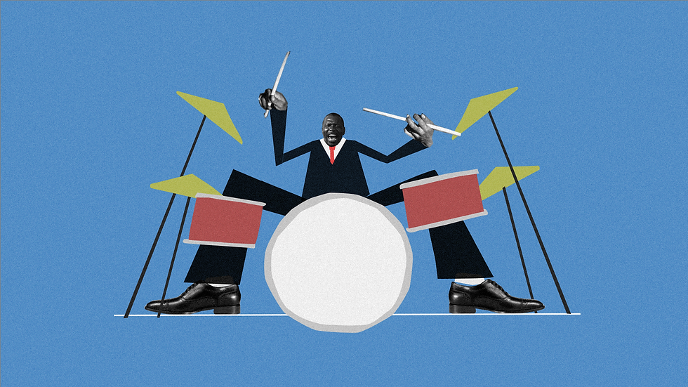
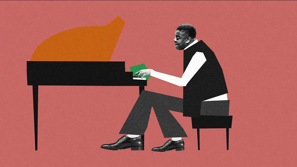
These two styleframes represent my concept's evolution. For the Blue one I aim to merge graphic design with a collage approach to animate a band. On the right, I employ traditional graphic techniques, utilizing abstract shapes to symbolize musical instruments.
The main challenge of this project lies in establishing a connection with younger people. To achieve this, the design and animation must resonate with their preferences and tastes. If these elements do not align with their interests, the project runs the risk of failing to engage its target audience effectively.
I looked up some references for graphic musical brands. The top one is from BUCK. I really like how they merging the characters inside of the shapes.
Challenge

I utilized expressions to link the graphics together and parented them to a null object, allowing me to manipulate their positions by simply adjusting the null.


bottom of page